使用方法
与页面类似,一个自定义组件也由 json、wxml、wxss、js 四个文件组成。编写自定义组件需要在 json 文件中声明:
在页面中使用自定义组件之前,要在页面的 json 文件中进行引用声明:
1
2
3
4
5
6
| {
"usingComponents": {
// 自定义标签名只能包含小写字母,中划线和下划线
"component-tag-name": "page/to/custom/component"
}
}
|
然后就可以使用自定义组件:
1
2
3
| <view>
<component-tag-name inner-text="Some text"></component-tag-name>
</view>
|
组件模板和样式
可以向组件传递节点,用于承载需要组件引用的子节点。需要使用多个 slot 时需要在组件的 js 中声明,用 name 区分:
1
2
3
4
5
6
7
8
9
10
11
12
13
14
15
16
17
18
19
20
21
22
| //组件 js
Component({
options: {
multipleSlots: true
}
})
//组件 wxml
<view class="wrapper">
<slot name="before"></slot>
<view>这里是组件的内部细节</view>
<slot name="after"></slot>
</view>
//页面 wxml
<view>
// 可以使用数据绑定向子组件的属性传递动态数据
<component-tag-name prop-a="{{dataFieldA}}" prop-b="{{dataFieldB}}">
<view slot="before">这里是插入到组件 slot name="before"中的内容</view>
<view slot="after">这里是插入到组件 slot name="after"中的内容</view>
</component-tag-name>
</view>
|
组件对应的 wxss 文件的样式只对组件 wxml 内的节点生效,在组件内不能使用 id、属性、标签、后代选择器,子元素选择器>只能用于 view 组件和其子节点。可以使用:host 指定所在节点的默认样式。
在自定义组件激活 addGlobalClass 选项可以让自定义组件能被 app.wxss 或页面的 wxss 中的所有样式影响。
在 Component 中可以用 externalClasses 定义若干个外部样式类,样式类是写在页面中的。
1
2
3
4
5
6
7
8
9
10
11
12
| // 页面 wxml
<custom-component my-class="red-text" />
// 组件 wxml
<custom-component class="my-class">
这段文本的颜色由组件外的 class 决定
</custom-component>
// 组件 js
Component({
externalClasses: ['my-class']
})
|
Component 构造器
1
2
3
4
5
6
7
8
9
10
11
12
13
14
15
16
17
18
19
20
21
22
23
24
25
26
27
28
29
30
31
32
33
34
35
36
37
38
39
40
41
42
43
44
45
46
47
48
49
50
51
52
53
54
55
56
57
58
59
60
61
| Component({
// 用于组件间的代码共享,可以使用 Behavior()构造器定义,每个 behavior 包含一组属性、数据、声明周期和方法,被组件引用时,这些东西会被合并到组件中去
behaviors: [],
properties: {
// 如果用 Component 构造页面,在 properties 中可以接收到页面参数
myProperty: { // 属性名
type: String, // 类型(必填),目前接受的类型包括:String, Number, Boolean, Object, Array, null(表示任意类型)
value: '', // 属性初始值(可选),如果未指定则会根据类型选择一个
observer(newVal, oldVal, changedPath) {
// 属性被改变时执行的函数(可选),也可以写成在 methods 段中定义的方法名字符串, 如:'\_propertyChange'
// 通常 newVal 就是新设置的数据, oldVal 是旧数据
}
},
myProperty2: String // 简化的定义方式
},
data: {}, // 私有数据,可用于模板渲染
lifetimes: {
// 生命周期函数,可以为函数,或一个在 methods 段中定义的方法名
attached() { }, // 在组件实例进入页面节点树时
moved() { }, // 在组件实例被移动到节点树另一个位置时执行
detached() { }, // 在组件实例从页面节点树移除时执行
// 还有 created、ready、error 生命周期
},
pageLifetimes: {
// 组件所在页面的生命周期函数
show() { }, // 页面被展示时执行
hide() { }, // 页面被隐藏时执行
resize() { }, //页面尺寸变化时执行
},
methods: {
onMyButtonTap() {
this.setData({
// 更新属性和数据的方法与更新页面数据的方法类似
})
},
// 内部方法建议以下划线开头
_myPrivateMethod() {
// 这里将 data.A[0].B 设为 'myPrivateData'
this.setData({
'A[0].B': 'myPrivateData'
})
},
_propertyChange(newVal, oldVal) {
}
}
})
|
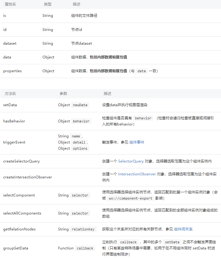
组件中包含一些通用属性和方法,可以通过 this 访问:
组件间通信、事件与关系
组件间通信
父 -> 子:wxml 数据绑定通过设置属性传递数据,或通过 this.selectComponent 方法获取子组件实例对象
子 -> 父:通过事件传递数据
监听/触发事件
1
2
3
4
5
6
7
8
9
10
11
12
13
14
15
16
17
18
19
20
21
22
23
24
25
26
27
28
29
30
31
32
33
34
| // 监听事件
// 父组件 wxml
<component-tag-name bind:myevent="onMyEvent" />
// 父组件 js
Page({
onMyEvent(e) {
e.detail // 自定义组件触发事件时提供的 detail 对象
}
})
// 触发事件
// 子组件 wxml
<button bind:tap="onTap">点击这个按钮将触发“myevent”事件</button>
// 子组件 js
Component({
properties: {},
methods: {
onTap() {
const myEventDetail = {} // detail 对象,提供给事件监听函数
// 触发事件的选项
const myEventOption = {
bubbles: Boolean, // 表示事件是否冒泡,默认为 false
composed: Boolean, // 表示事件是否可以穿越组件边界,默认为 false
capturePhase: Boolean, //表示事件是否有捕获阶段,默认为 false
}
this.triggerEvent('myevent', myEventDetail, myEventOption)
}
}
})
|
组件间关系
如果两个自定义组件有嵌套关系,相互间的通信比较复杂,可以加入 relations 定义段。需要在两个组件定义中都加入 relations 定义,否则不会生效。
1
2
3
4
5
6
7
8
9
10
11
12
13
14
15
16
17
18
19
20
21
22
23
24
25
26
27
28
29
30
31
32
33
34
35
36
37
| // 组件 wxml
<custom-ul>
<custom-li>item 1</custom-li>
<custom-li>item 2</custom-li>
</custom-ul>
// 外层组件 js
Component({
relations: {
'./custom-li': {
type: 'child', // 关联的目标节点应为子节点
linked(target) {
// 每次有 custom-li 被插入时执行,target 是该节点实例对象,触发在该节点 attached 生命周期之后
},
linkChanged(target) {
// 每次有 custom-li 被移动后执行,target 是该节点实例对象,触发在该节点 moved 生命周期之后
},
unlinked(target) {
// 每次有 custom-li 被移除时执行,target 是该节点实例对象,触发在该节点 detached 生命周期之后
}
}
},
methods: {
_getAllLi() {
// 使用 getRelationNodes 可以获得 nodes 数组,包含所有已关联的 custom-li,且是有序的
const nodes = this.getRelationNodes('path/to/custom-li')
}
},
ready() {
this._getAllLi()
}
})
|
内层组件写法类似,type 为 parent,linked / linkChanged / unlinked 代表被插入/移动/移除时执行。
如果外层组件想要关联两个内层组件,并且如果两个组件都有一个 behavior:
1
2
3
4
5
6
7
8
9
10
11
12
13
14
15
16
17
18
19
20
21
22
23
24
25
26
27
28
29
30
31
| // 组件 wxml
<custom-form>
<view>
input
<custom-input></custom-input>
</view>
<custom-submit>submit</custom-submit>
</custom-form>
// 外层组件 js
const customFormControls = require('./custom-form-controls')
Component({
relations: {
customFormControls: {
type: 'descendant', // 关联的目标节点应为子孙节点
target: customFormControls
}
}
})
// 内层组件 js
const customFormControls = require('./custom-form-controls')
Component({
behaviors: [customFormControls],
relations: {
'./custom-form': {
type: 'ancestor', // 关联的目标节点应为祖先节点
}
}
})
|
抽象节点
当自定义组件模板中的节点由调用者决定时,就可以把节点声明为抽象节点。
1
2
3
4
5
6
7
8
9
10
11
12
13
14
15
16
17
18
19
20
21
22
23
24
25
26
27
28
29
30
31
| // 一个选框组组件,可以放置单选框或者复选框
// 组件 wxml
<view wx:for="{{labels}}">
<label>
<selectable disabled="{{false}}"></selectable>
{{item}}
</label>
</view>
// 组件 json
{
"componentGenerics": {
"selectable": true
// 可以指定一个默认组件
//"selectable": {
// "default": "path/to/default/component"
//}
}
}
// 调用组件的 wxml
<selectable-group generic:selectable="custom-radio" />
<selectable-group generic:selectable="custom-checkbox" />
// 调用组件的 json,有可能调用的组件都需要包含在 json 的 usingComponent 中
{
"usingComponents": {
"custom-radio": "path/to/custom/radio",
"custom-checkbox": "path/to/custom/checkbox"
}
}
|